

When I installed the preview of Dynamics 365 Finance and Operations version 10.0.32, also known as the April 2023 release, it was noticeable the user interface got restyled slightly. Apart from this, also some navigation concepts have been changed. In this post, I will highlight the changes I noticed myself so far.
One Dynamics One Platform
A huge focus for Microsoft is the topic of One Dynamics One Platform (ODOP). Having different personas in mind, this theme brings the Finance and Operations apps and Microsoft Power Platform closer together to take full advantage of the apps and features offered on both platforms. Microsoft clearly is using the word “convergence”. One platform will not replace the other. Apart from focusing on the Admin and Developer, a third persona is the end user. With the current preview, it is noticeable that some user interface and navigation concepts are overthought and get aligned between the apps from the different platforms. These changes are initially confusing for existing users who are using Dynamics 365 Finance and Operations today but they are beneficial if the user is using multiple apps in the Dynamics 365 suite. Let’s have a look at the details.
Comparing the differences
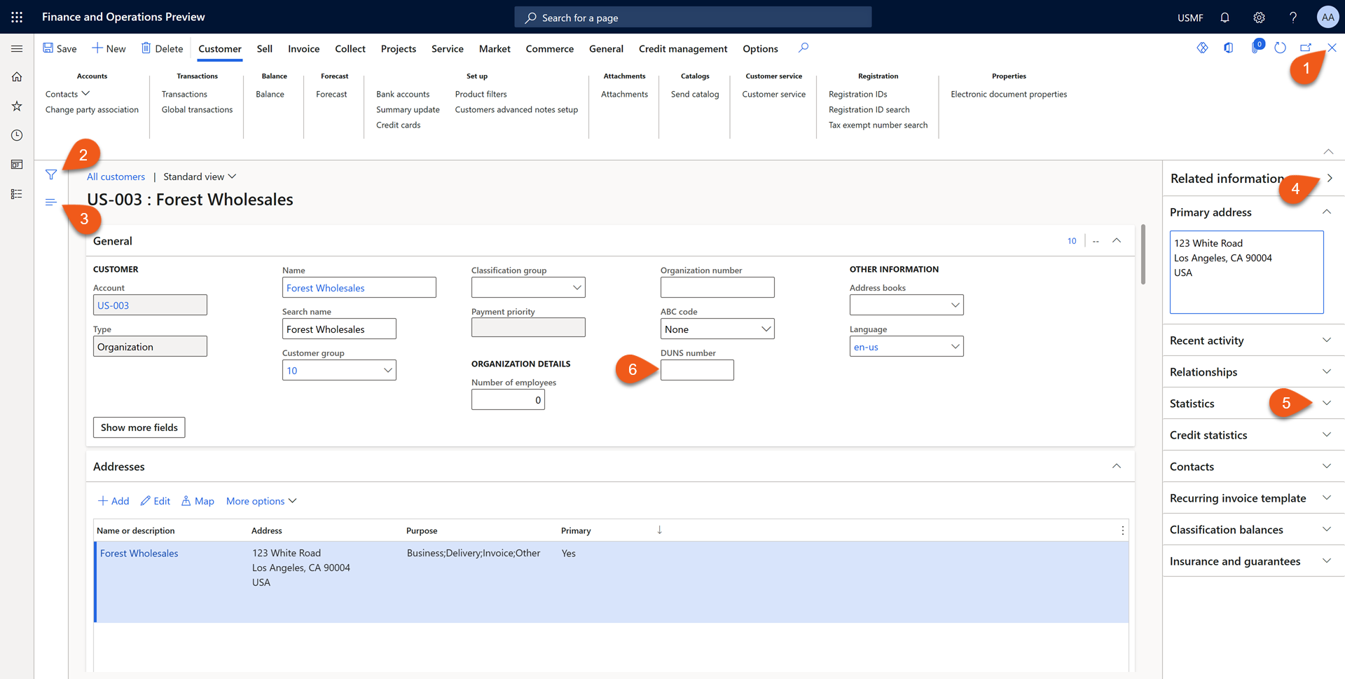
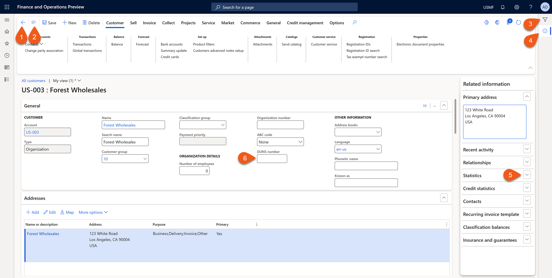
I will start sharing screenshots of the customer details form where the differences in navigation are marked. The first screenshot is from the current style and the second is the preview with the new changes.
Let’s have some more understanding of the changes and their impact.
- The Close button is moved from the right side to the left side and has a different icon. The shortcut key remains the same. With the Esc-key you can close the form. The Go back icon is also used in other Dynamics 365 and Power Platform applications using the Unified interface. The same icon is also used in web browsers.
- When you are on a details form, you can open the list of records in a list at the left side of the details. The button has been moved to the standard action pane.
- The button to start filtering records has been moved to the top right side of the application. You will read more details about this below.
- The button to show or hide the related information pane has a new icon and is moved to the right top side of the application.
- The button to expand or collapse a particular form part now has been framed. The same change has been implemented on tab pages.
- You might need a loop to see the difference, but the entry controls now have rounded edges.
Alignment across multiple Dynamics 365 apps
With the upcoming changes in Dynamics 365 F&O, still the apps look different. When looking at the changes for the Go back/Close experience and the filter button, this seem to be a convergence between the various experiences.
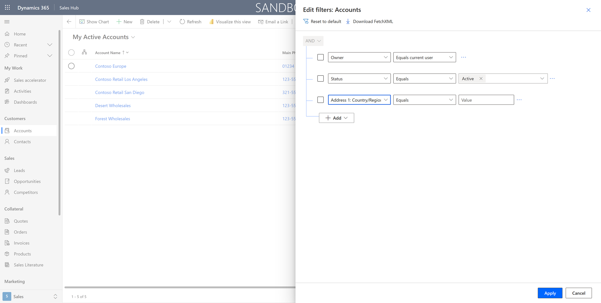
When opening the filter pane in the new version, you will see it appearing at the right side, where is was at the left before.

The position change aligns with other applications using the unified interface, like Dynamics 365 Sales Hub. The layout of how to maintain the filters is still different.
Conclusion
Dynamics 365 F&O got a facelift. There are some more minor changes to the style of the application. E.g. you will see a difference when you start creating a new customer. The tab pages now look also a bit different. I do expect there will be more convergence on the user experiences between the Dynamics 365 and Power Platform applications.
Even when you read the blog, I bet you will search multiple times for the Close, List, and Filter buttons when working with the April 2023 release yourself. Even for me, after several times working with this version and moving back to older versions, I tend to go to the wrong position for these buttons myself. With our habits, we are used to do certain things in a particular way. I don’t mind a change if this will be making One Dynamics consistent.
I do hope you liked this post and will add value for you in your daily work as a professional. If you have related questions or feedback, don’t hesitate to use the Comment feature below.
That’s all for now. Till next time!

 Original image by Ben Kerckx from Pixabay
  Image by forium from Pixabay


Great value – Thanks a lot
We noticed, that filter in a grid with the operator ‘is on of’ was also changed.
Previously, when you put multiple values and press ‘enter’ button on the keyboard – the filter applied.
Now, when you press ‘enter’ button – the lookup window is opening. It means that you should click ‘apply’ filter manually. Did you face with it? What do you think about it?
Hi Aniko,
Thanks for your comments. To be honest, I don’t know if there was a change here or not. Usually, I don’t use the ‘enter’ key but click with my mouse. What I notice now, is that when entering values in one box separated by commas, you can use the ‘tab’ key to get the values created. The ‘Apply’ button then gets the focus. Then the ‘Enter’ key is working correctly. When the ‘Apply’ button is not selected, you can use the ‘tab’ key to select other controls until it has the focus on the ‘Apply’ button.
One issue with all these changes is they have broken all out RSAT tests making our testing for the 10.0.33 upgrade very tedious!
In D365 F & 0 V46 , if you’re deep two or tree levels into a module and you click the <- back button on the form , it blows you back to the home page every time. Why ?
Hi Gordon,
Can you tell what exact version you are referring to? The current application version is 10.0.33 with platform update 57. Or did you made a typo and intended to mention platform update 56 instead of 46?
Thanks for this. Is there an official announcement/link from Microsoft listing all of these layout changes or do you just figure it out from using the application? I checked the Microsoft docs for change announcements (https://learn.microsoft.com/en-us/dynamics365/finance/get-started/whats-new-changed-10-0-32#feature-enhancements-included-in-this-release) but it includes only detailed functional changes and not changes in user experience.
Thanks
Hi Ahmad,
Like you suggested, I found out the change when opening the application, the first time. There were some words in the what’s new documentation about a “visual refresh”, but it didn’t had the exact details. You can read about it here: Platform updates for version 10.0.32 of finance and operations apps (March 2023)
Hi,
The new update has caused the Packers not to be able to scan full box without pressing the Enter button. Before the update; they could scan a full box and the system would automatically go to the next box. This I slowing the packing process down drastically.
Any idea?
Hi Srikanth,
Is your question related to the mobile warehouse app? If so, this is not related to my blog post. I would suggest asking your question on the SCM forum at the Dynamics Community.